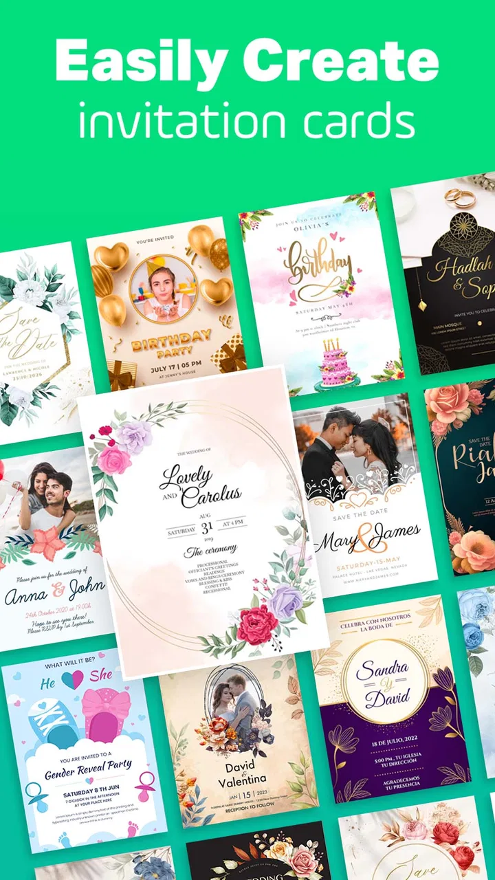
Invitation Card Maker & Invite
- 3.3
- Rating
- 500.00K
- Installs
- Free
- Price

 Analysis by App-foxy
When I need to invite people to a birthday, anniversary, wedding-related gathering, or a simple party, I usually want something more personal than a plain message but less demanding than designing a full event package. Invitation Card Maker & Invite fits that middle ground. It is a free event app from SoftAxes that focuses on creating invitation cards, and its appeal is easy to understand: start with a few details, shape the card until it feels like your event, then share the finished design through the communication method you already use.
I approached it as I would with a real invitation rather than treating it like a gallery of pretty templates. The important question is not whether a card can look attractive in isolation. It is whether I can move from a vague idea—“I need something elegant for Saturday”—to a usable invitation without getting stuck in decoration, unclear wording, or a difficult handoff to guests. In that respect, this app is most useful when I treat it as a quick visual communication tool, not as a complete event-management system.
From a rough idea to a finished invitation
I find the invitation comes together more smoothly when I treat the first draft as a layout test, not a finished card. Once the essential wording is in place, I can judge whether the design gives the occasion the right feel while leaving the practical details easy to spot. That sets up the next step: shaping the card around the event rather than letting decoration lead the process.
You May Also Like

 Blood Strike: 2.5 Anniversary
Blood Strike’s Loadouts Turn Every Drop Into a Tactical Gamble
A close look at Blood Strike’s custom loadouts: how fast access to signature weapons reshapes its battle royale rhythm, rewards preparation, and narrows the gap between fights.

 Pandora - Music & Podcasts
Pandora’s Music Is Easy to Start, but Harder to Recover
Pandora’s strength is its low-effort path from a seed to a station. Its weak spot is how much confidence it asks you to place in connection, setup, and quiet recovery.

 8 Ball Pool
 Is Built on Rivalries, Rematches, and Routine
A close look at the rivalries, rematches, shared routines, and unanswered safety questions that turn a quick pool match into a persistent mobile community.

 Samsung Music
’s Quiet Strength Is Playing What You Already Own
Its reach comes less from spectacle than from dependable access to a personal library. That simplicity is both the app’s strongest retention engine and its ceiling.

 AccuWeather: Weather Radar
AccuWeather Review: A Quick, Clear Forecast for Everyday Decisions
For everyday plans, the best forecast is the one you can understand quickly. AccuWeather makes rain timing, radar, and local conditions easy to act on, with a few trade-offs.

 Hill Climb Racing
Why Hill Climb Racing Still Turns Crashes Into One More Run
A tiny car, a bumpy hill and one more upgrade: Hill Climb Racing keeps resurfacing because its simple chaos makes every near-miss feel personal.
More From Our News Desk



Starting with the event, not the design
The smoothest way to use the app is to decide the basic message before opening the editor. I first work out the occasion, the tone, the date, the location, and the response instruction. That small preparation matters because invitation makers can tempt me to choose colors and ornaments before I know what the card actually needs to say. If the wording is undecided, even a polished layout can become crowded later.
For a birthday, I might need only the celebrant’s name, the date, the start time, the venue, and a short request to confirm attendance. A wedding-related event usually needs a calmer visual approach and more careful spacing. An informal party can tolerate a stronger color choice and shorter copy. The app’s purpose covers these different situations, but the quality of the result still depends on matching the amount of information to the design rather than trying to place every detail on the front.
This is one of the first useful trade-offs I noticed: a stylish invitation is not automatically a clear invitation. Decorative elements can help establish mood, but they also compete with the practical details guests need. I get better results when I choose a visual direction first and then keep the wording compact enough to breathe around it.
Building the card in a sensible order
My preferred workflow is to establish the main heading first, add the event details second, and leave small decorative adjustments until the end. That order reduces rework. If I begin by fine-tuning ornaments, I can easily discover that the date or venue needs more room and then have to undo the visual balance I just created.
I also read the invitation at normal phone size before considering it finished. A design can look balanced while I am concentrating on the editor, yet become harder to scan when viewed as a shared image. I look specifically for three things: whether the occasion is obvious immediately, whether the date and time stand apart from supporting text, and whether the location can be found without searching through a paragraph.
That simple check is especially important for recipients who are viewing the invitation quickly in a chat. They may not save the image or study it later. A good card should communicate the essential information in a few seconds. I would rather remove one decorative line than make a guest hunt for the start time.
Using templates without losing the personal touch
The app is designed for people who want a more finished look than a blank canvas provides. That makes it suitable for users who are not comfortable with design software, but I would not accept the first attractive arrangement automatically. The most convincing invitations are usually the ones where I adjust the wording and visual emphasis to suit the actual gathering.
For example, a formal layout can feel out of place for a relaxed family meal, while a playful style may undermine a restrained anniversary celebration. I use the available design direction as a starting point, then make the content sound like something I would genuinely send. A short personal line can do more for warmth than adding another decorative feature.
A practical tip is to prepare two versions when the audience is mixed. One can be more formal for older relatives or professional contacts, while the other can use friendlier wording for a casual group. This does not mean creating two entirely different invitations. Keeping the central details consistent while changing the greeting or closing can make the handoff feel more natural.
Checking the details before sharing
Invitation design has a particular risk: mistakes are easy to overlook because the card looks attractive. I proofread the date, time, address, names, and response instructions separately from the visual review. Reading the content backward or checking each line against my original notes is surprisingly effective because it prevents my brain from filling in what it expects to see.
I also consider whether a guest needs extra context. If the venue is unfamiliar, the card may need a clearer location description. If the event has a dress expectation, that should be stated plainly rather than implied by the design. If guests should bring something, I include it only when it is genuinely useful. The app can help present the message, but it cannot decide which practical details matter to my guests.
Moving from the editor to the guest
The finished card is only successful when it leaves the app cleanly and reaches the right people. I treat the sharing stage as a separate step rather than assuming that a completed design equals a completed invitation. Before sending, I check the image at full size, confirm that the text remains readable, and decide whether the recipient needs a short message alongside it.
That accompanying message is an underrated part of the workflow. A card can contain the formal information, while the chat message explains why I am sending it and what response I need. For example, I might ask a guest to confirm by a particular point or mention that the invitation is intended for the whole household. This keeps the card visually tidy without forcing every instruction into the design.
I would also avoid sending the same wording blindly to every contact. A personal note is more appropriate for a small dinner, while a concise group message works better for a larger party. The app handles the visual invitation; the communication platform handles the conversation, replies, reminders, and changes.
A realistic everyday scenario
Imagine I am arranging a birthday gathering with only a few days to prepare. I begin with a short list of essential details, choose a design that suits the person being celebrated, and create the card without trying to turn it into a full event website. I then view it as a guest would, notice that the venue line is too dense, shorten the wording, and make the practical information easier to scan.
After that, I share the image individually with close family and in a group chat for friends. For the family messages, I add a personal sentence and ask about attendance. In the group, I keep the note brief and make the confirmation request obvious. When one detail changes, I can prepare an updated card and clearly label it as the latest version rather than leaving guests to guess which image is current.
This scenario shows both the app’s strength and its boundary. It helps me make the invitation look intentional and consistent, but I still manage the guest list, replies, reminders, and last-minute changes outside the app. For a small event, that division is perfectly workable. For a complicated occasion, it becomes more noticeable.
Where the handoff becomes less convenient
The main friction appears after the design is ready. A card maker is not the same as a digital invitation service with attendance tracking, guest management, calendar coordination, or an organized update history. If I need guests to respond in a structured way, I have to provide that instruction separately and keep track of the answers myself.
This matters when the guest list grows. In a small circle, a few replies in a messaging app are manageable. With a larger event, responses can become scattered across private chats and group conversations. The visual card may still do its job, but the surrounding administration becomes manual. Someone looking for one place to manage invitations and attendance may be better served by a dedicated event platform.
There is also a version-control issue. If I correct a time or location after sending the first card, I need to make the replacement unmistakable. Sending a revised image without explaining the change can create confusion, especially when guests keep both versions in their chat history. My practical solution is to mention the exact corrected detail in the message, not rely on everyone to compare two designs.
What the app is like to live with
As an app in the Events category, it is focused enough to be approachable. I do not have to learn a broad productivity suite before making a card. The free price makes it easy to try for a one-off occasion, and the Everyone content rating makes it suitable for a wide household audience. The app has passed half a million installs, so it is not an obscure experiment with no visible user base.
At the same time, the average rating sits at 3.3 from roughly six hundred ratings, which suggests a mixed experience rather than universal satisfaction. I read that as a reason to keep expectations realistic. The app can be useful for a quick design task, but individual preferences about editing, available styles, and the overall workflow will matter. I would test the creation process with a small invitation before relying on it for a major event.
SoftAxes released it on April 19, 2024, and the current version is 1.2.6. It supports Android 7.0 and later, which gives it broad compatibility with older devices. That is helpful if I am preparing an invitation on a phone that is not recent, although compatibility alone does not guarantee that every screen will feel equally comfortable on every device.
Free to start, with a purchase decision to consider
The app is free to download and use as a starting point, while in-app purchases cost $1.99 per item. I would not treat that as an automatic problem, but I would pay attention to the point at which a particular design or asset asks for payment. For a single event, the decision is straightforward: if the paid item saves time and gives me the appearance I want, it may be worthwhile; if I am making several cards, the individual purchases deserve more scrutiny.
My advice is to settle the wording and basic layout before spending anything. Paying for an element will not fix a poorly planned message, an overcrowded card, or an unclear response request. I would also compare the finished result with a simple free design before committing, because the value is not just the visual effect—it is how much effort the purchase removes from the whole workflow.
Who will get the most from it
I would recommend this app to someone who wants a presentable invitation quickly and is comfortable handling the guest conversation elsewhere. It suits birthday plans, family celebrations, anniversaries, casual parties, and smaller gatherings where a shared card adds warmth without requiring a complicated system.
It is particularly useful for a person who has the event details ready but does not want to build a design from scratch. It can also help when several people are coordinating an event and need a consistent card to share. The visual format makes the invitation feel more deliberate than a plain text message, while still being easy to send through familiar channels.
Who should choose another kind of tool
I would skip it if the central need is registration rather than presentation. A conference, large ceremony, or event with meal choices, ticketing, payment, automated reminders, or attendance limits needs a more specialized service. In those cases, an attractive image is only one small part of the job, and manual follow-up can quickly become the weak link.
I would also hesitate if I needed a highly controlled brand identity, advanced layout precision, or collaborative editing with several organizers. A full design application may offer better control, while an event-management platform may offer better coordination. This app makes sense when speed and visual polish are more important than deep administration.
My final take after following the complete workflow
Invitation Card Maker & Invite does its best work at the front of the event process: turning a rough plan into a card that feels ready to send. I like the idea of using it as a focused design step, then pairing the result with a thoughtful message and a separate method for collecting replies. That approach keeps the invitation attractive without pretending it can manage everything around the event.
The most important habit is to judge the outcome from the guest’s point of view. Is the occasion clear? Can the date, time, and place be found immediately? Does the message explain what I want the recipient to do? If the answer is yes, the app has done its job. If I need structured responses, frequent updates, or a large-scale guest workflow, I would choose a different category of tool.
For a free event app with optional items priced at $1.99 each, it offers a practical way to add personality to everyday invitations. I would use it for a small or medium gathering, proofread carefully, and keep the handoff organized. Its value is not that it replaces every event tool; it is that it gives an ordinary invitation a more considered visual finish without making the design process feel like a professional project.
FAQs for Invitation Card Maker & Invite
01What features does Invitation Card Maker & Invite offer?
Invitation Card Maker & Invite provides a wide variety of templates for different events like weddings, birthdays, and parties. Users can customize invitations with text, images, and stickers. The app also offers options to change fonts, colors, and layouts to make each invitation unique. Additionally, users can share invitations directly via email or social media.
02Is Invitation Card Maker & Invite free to use?
Invitation Card Maker & Invite offers both free and premium options. While the free version includes basic templates and design tools, the premium version unlocks additional templates, exclusive design elements, and an ad-free experience. Users can choose to purchase a monthly or yearly subscription based on their needs.
03Can I use my own images in the invitation designs?
Yes, the app allows users to upload their own images and incorporate them into their invitation designs. This feature provides additional customization and personalization. Users can adjust the size, position, and orientation of images to fit the overall design theme of their invitation.
04Is it possible to print invitations directly from the app?
Invitation Card Maker & Invite supports high-resolution downloads, which means users can save their invitations as image files or PDFs for printing. While the app doesn’t directly connect to printers, users can easily transfer the files to a computer or printing service for high-quality prints.
05Does the app require an internet connection to function?
Users need an internet connection to download the app, access new templates, and share invitations online. However, once the templates are downloaded and installed, the app can be used offline for creating and editing invitations. Some features, like cloud storage or online sharing, require connectivity.
Pros
- User-friendly interface for quick navigation.
- Wide variety of templates available.
- Customization options are extensive.
- Supports multiple languages for invites.
- No watermark on free version downloads.
Cons
- Limited font styles in free version.
- Occasional ads disrupt editing process.
- Some templates look outdated.
- No option for video invitations.
- Limited integration with social media platforms.

Invitation Card Maker & Invite
Gallery